 A few improvements have been made to the site over the last week or so, starting with the wall.
Each article has its own comments section, but there’s not one for the site as a whole. Well, now there is. You can reach it by clicking on “contact” up in the top left corner of the site. We’ve already had some praise from Kromlech (a scant few hours after the wall went up), why not post your two cents?
Secondly, some time has been taken to fix the many other issues with the site, such as the background to the menu not rendering. If you spot something that’s broken, post it on the wall.
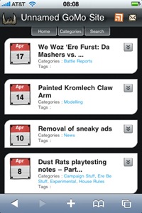
Finally, the site has ditched the old mobile version, WPtouch, in favour of WPtap. The old site wasn’t overly pretty and was a pain to customise, the new one took about an hour to get up to speed.
It’s not perfect, but it’s more suitable than the old one. The code is also easier to mess about with, allowing further customisation. Eventually the site may have a dedicated mobile section for play, as in resources that players might find useful to have access to in-game.
Any suggestions for mobile-specific content are welcome and can be left as comments to this post.
Leave a Reply